A brand & vision case study from Echelon Cycle Sport in Amsterdam.
When Twotone first began working with Echelon, the brief was not as clear as the vision: to become a cult shop at the heart of Amsterdam.
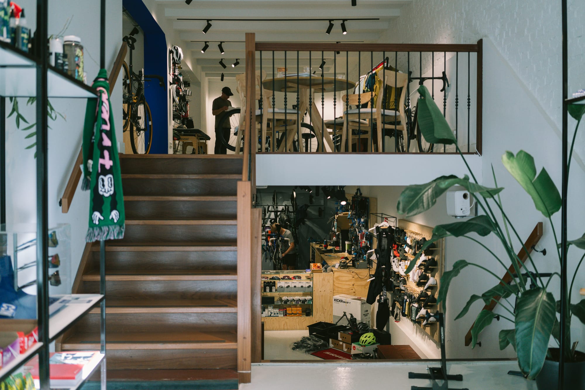
Located on the Bilderdijkstraat, Echelon Cycle Sport is the project of Wim Essers, a bike fitter and cycling enthusiast who took over En Route Café’s previously occupied space.
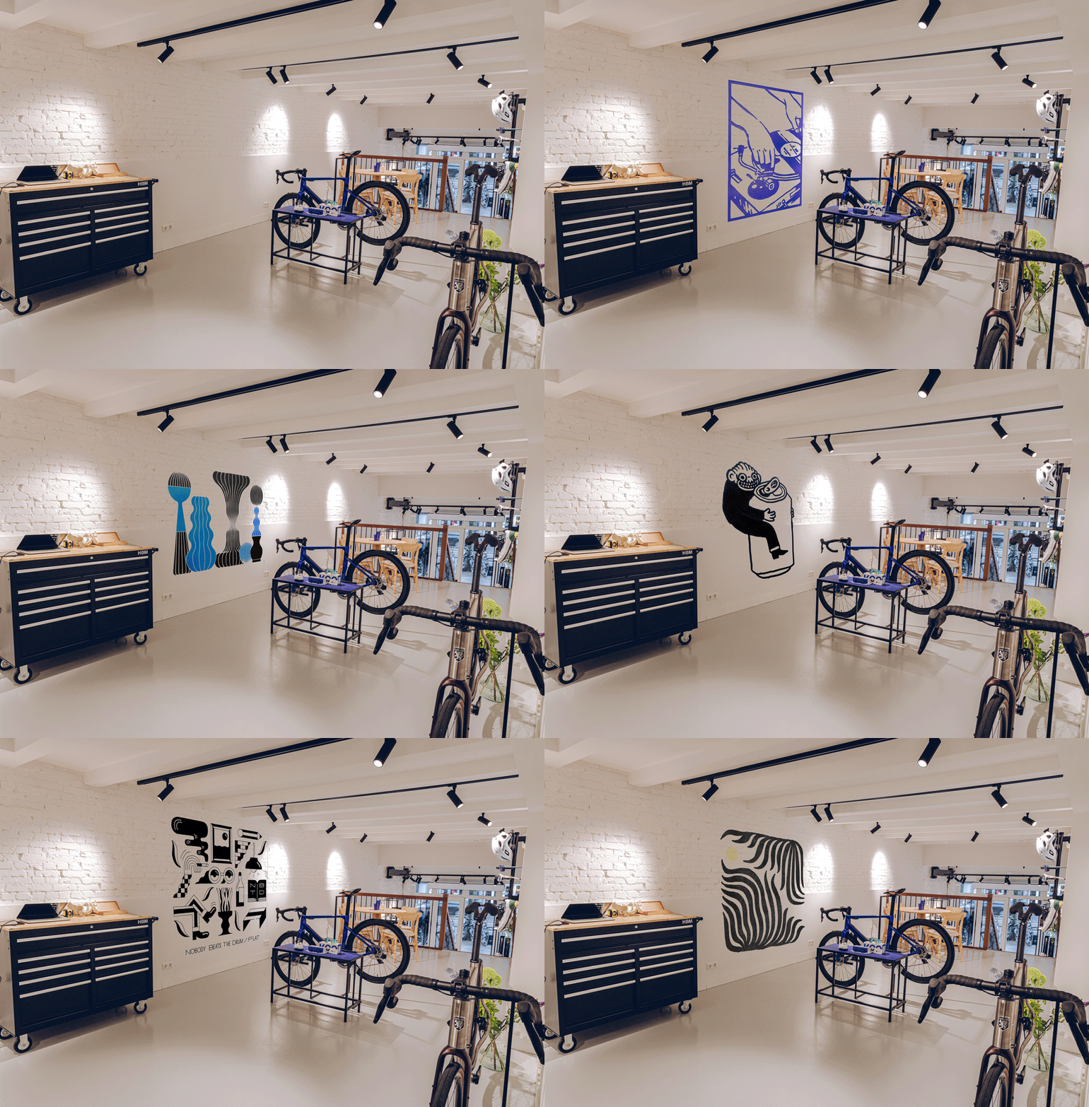
Essers’ first move was to strip everything away from the shop, choose a clear brand color, and dial the lighting. Everything was a blank slate; the solid workshop was upgraded, and a beautiful coffee machine was brought in.
Essers’ choices were not the obvious ones and clearly his vision and value proposition were more focused on the long term than the short one.

Universal Colors was chosen as the partner clothing brand, and Apex selected for bikes.
Together we first started working on ideas for the upper part of the shop and the opening party, next gravitating into the brand itself and its visual development.
First Step: The Logo
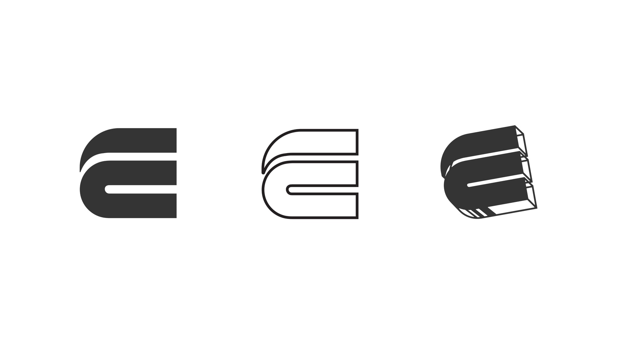
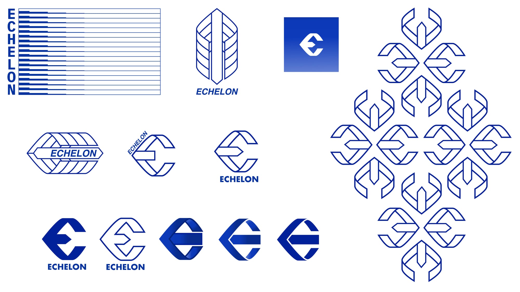
Wim Esser has clear taste and is confident in his choices, making him the perfect person to explore ideas and concepts, moving easily to execute or ditch the idea and start fresh. We had already chosen a logo, but felt something was missing, so we started by changing the solid volume by the outlines, exploring a 3D shape.
Clear lines and a dynamic impression were clear concepts for Twotone’s designer Kike Molares. “An echelon is a beautiful, powerful and perfectly aligned phenomenon, that occurs when a bunch of birds try to fight a clear wind vector to progress faster together,” commented Molares when reflecting about the first steps.
With this in mind, Molares not just expanded the logo, but also started to look for icons that together could build an echelon, thus finding the beginning of a visual identity.
Second step: the bird echelon, the flyer & the sticker
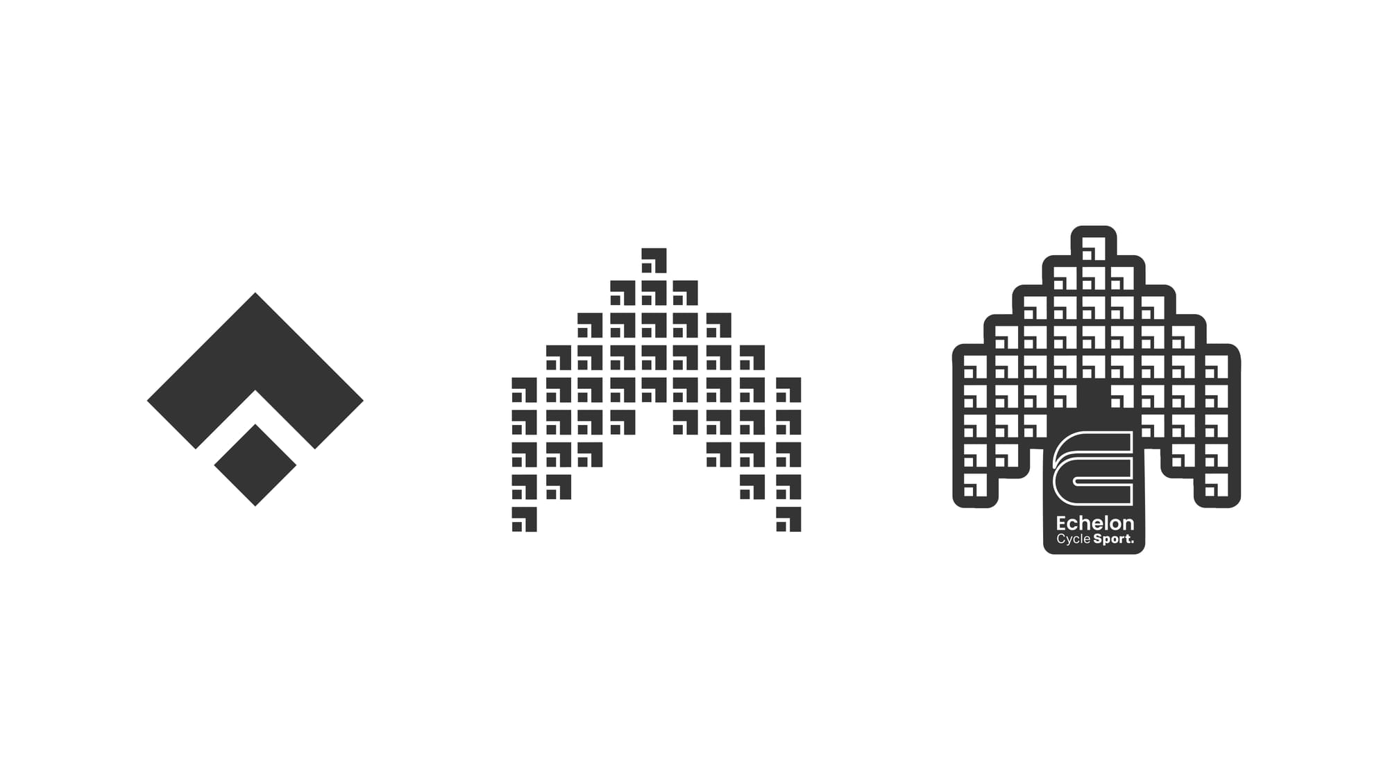
Wim Esser has clear taste and is confident in his choices, making him the perfect person to explore ideas and concepts, moving easily to execute or ditch the idea and start fresh. We had already chosen a logo, but felt something was missing, so we started by changing the solid volume by the outlines, exploring a 3D shape.
Clear lines and a dynamic impression were clear concepts for Twotone’s designer Kike Molares. “An echelon is a beautiful, powerful and perfectly aligned phenomenon, that occurs when a bunch of birds try to fight a clear wind vector to progress faster together,” commented Molares when reflecting about the first steps.
With this in mind, Molares not just expanded the logo, but also started to look for icons that together could build an echelon, thus finding the beginning of a visual identity.
Third step: the aero sock that never happened
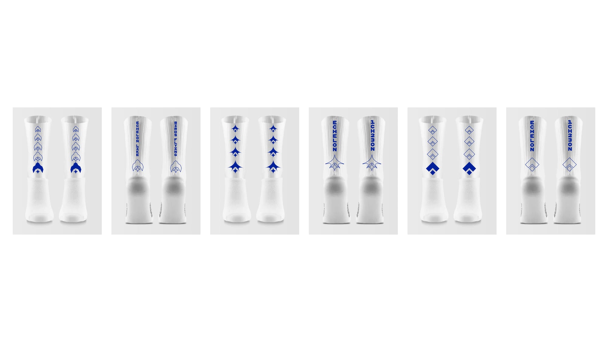
Sometimes in a project, there is a step that ends up both going nowhere and being the key for the rest of the project at the same time.
In this case, that was the aero sock: very expensive to produce, it was one of the favorite items of Essers, and a key element in the cycling kit to come. Taking that into account, Molares played with the idea that speed could be represented by the square shape, and inspired by the more sharp shape that pray birds have, which led to the first Echelon Aero sock design.
The graphics in this idea still need to be incorporated into the rest of the brand ecosystem, remaining one of Wim’s favorite elements designed up until now.
Forth step: The T-Shirt
Once the aero sock idea was ditched, Molares started to work in two different directions: design the new cycling kit, and create a regular t-shirt.
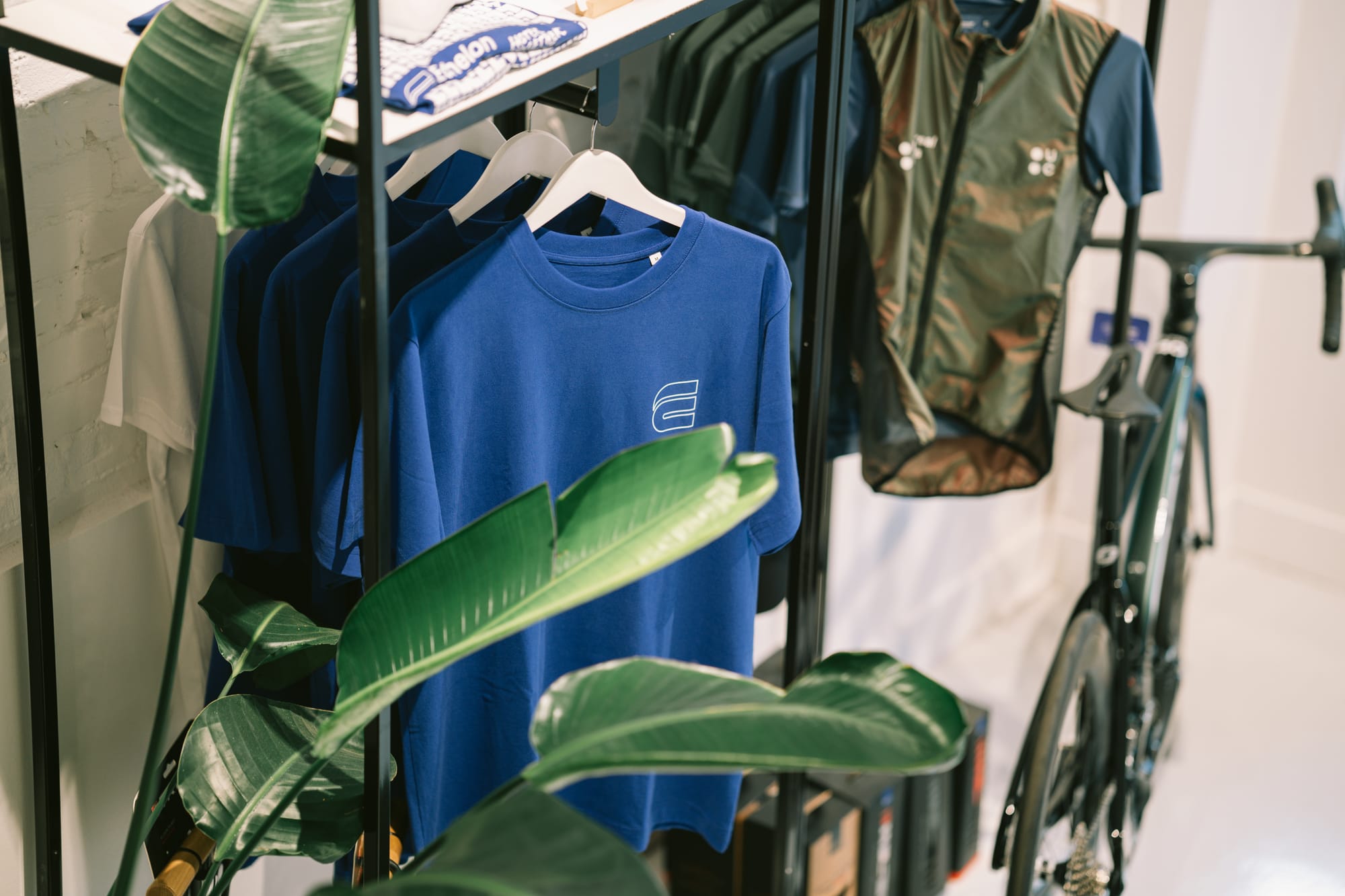
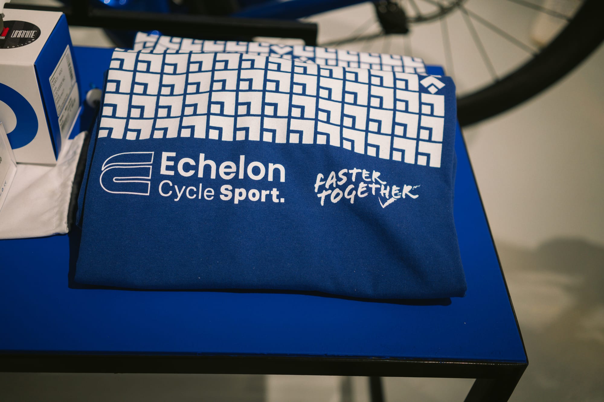
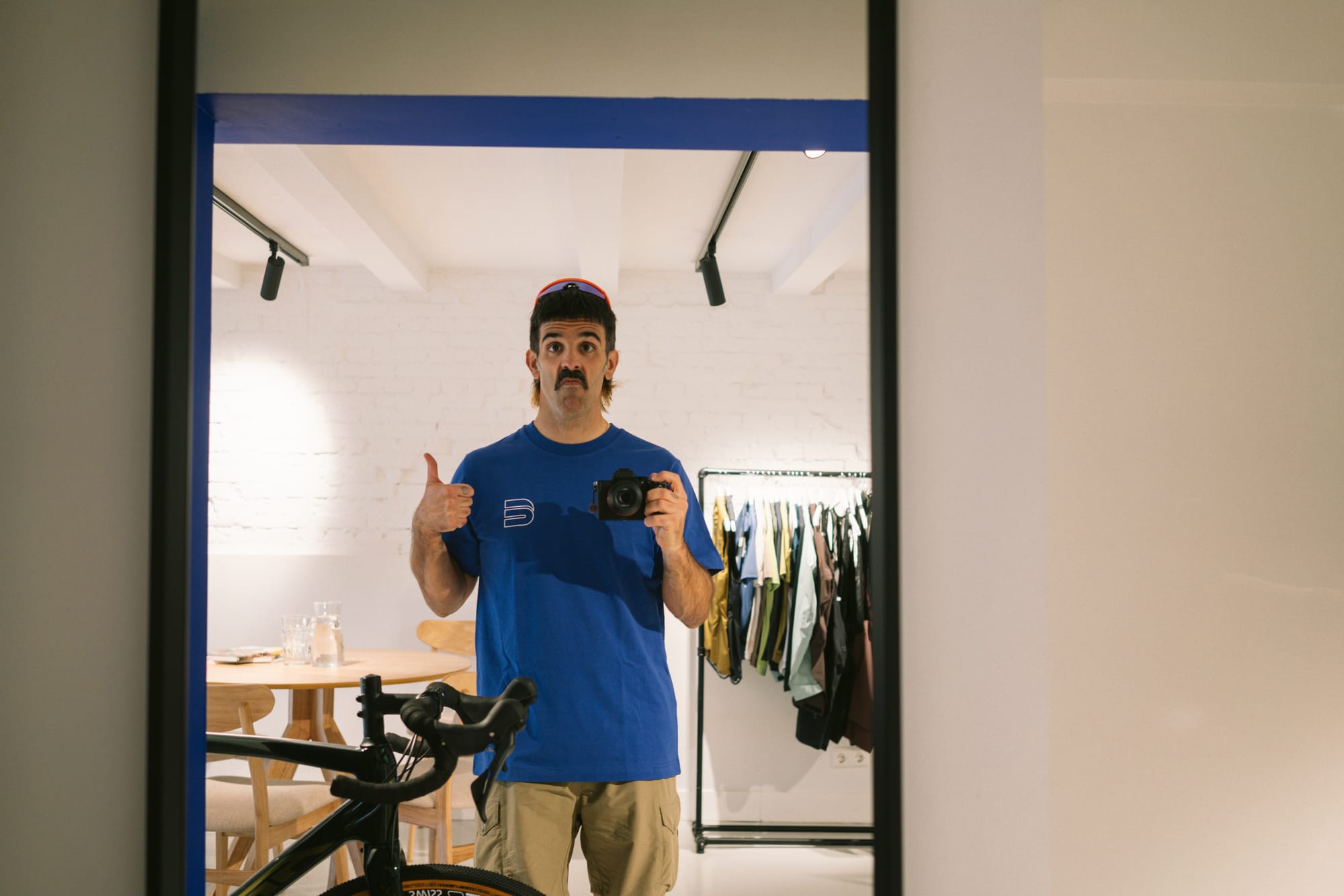
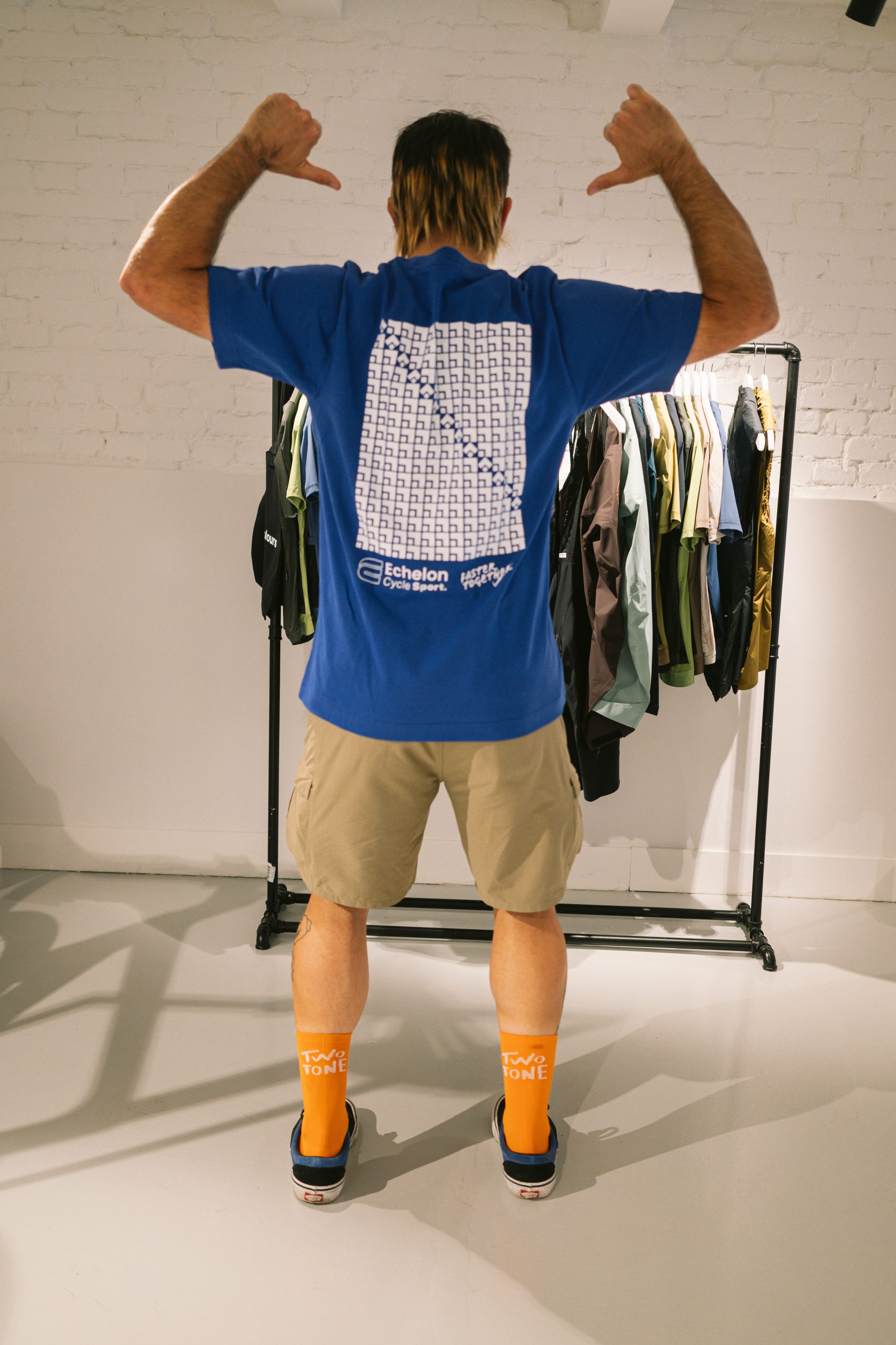
The T-Shirt idea came easy and was straight forward, as the aerosock experiment had served both Essers & Molares to understand how committed they were in the more squared bird concept. With that in mind, Kike went for a grid-based design that Wim signed off on right away, leading to the production of the first-ever Echelon casual tee.
Fifth Step: The bidons
The T-Shirt gave Essers & Molares reassurance that the brand was going in the right direction, allowing them to explore beyond what back then was the apparent direction.
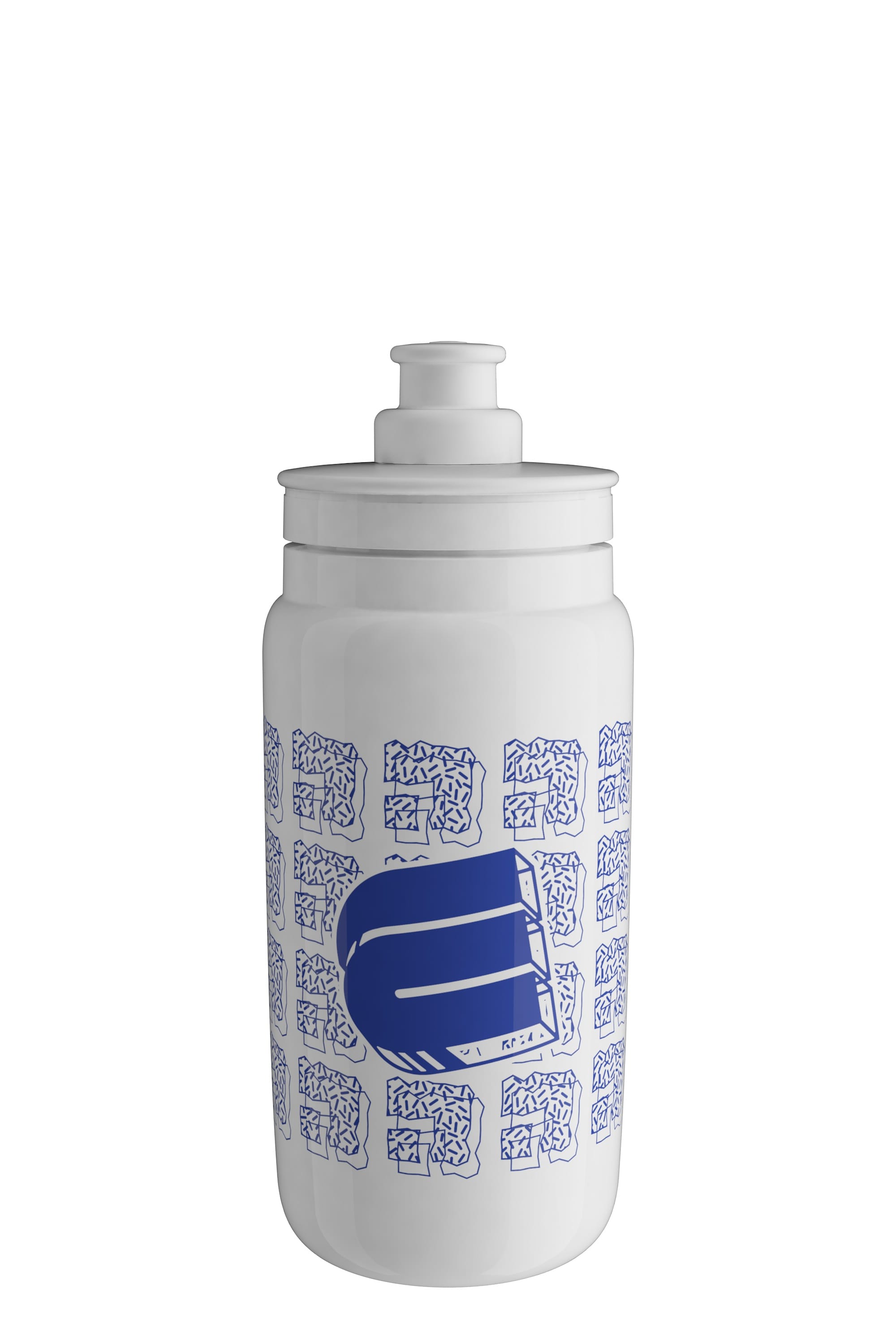
For the bidons, Molares played with textures, distorting the shape, and coming up with a design that had to be visually impactful to work only on one ink over a white bottle.
The results, we believe, were stunning, validating the first hypothesis of a brand with a clear coherence that could explore and go beyond the apparent directions.
Sixth step: The Kit
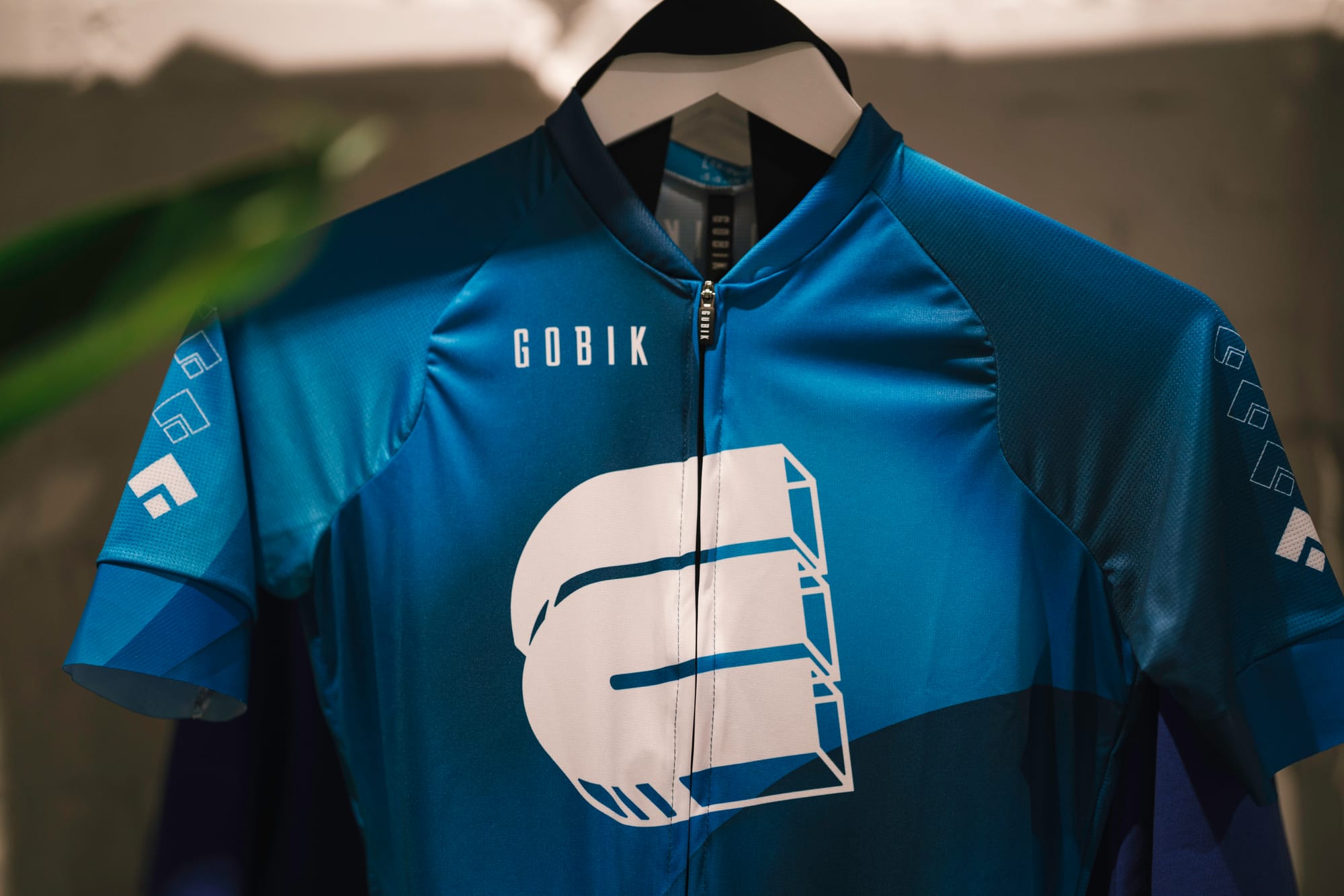
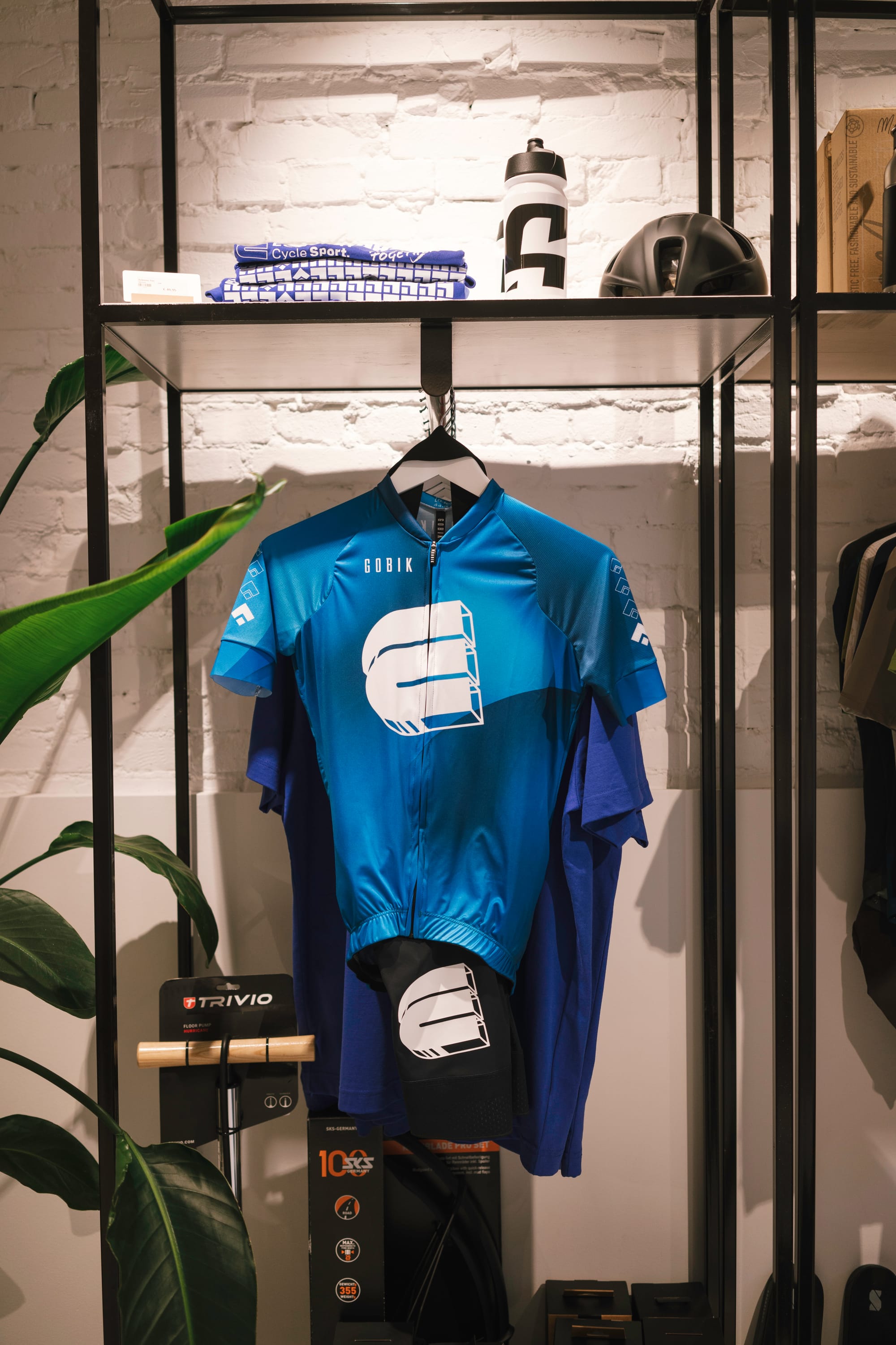
The first talks with Essers included, of course, the designing of the quintessential cycling shop item: the kit. If locals love the place and a community is built around it, they will want to wear the kit.
The initial plan was to have them ready for spring 2024, but everyone was too eager and the ideas were flowing, so we decided to create a first version of the kit for autumn 2023, with a long-sleeve design included.
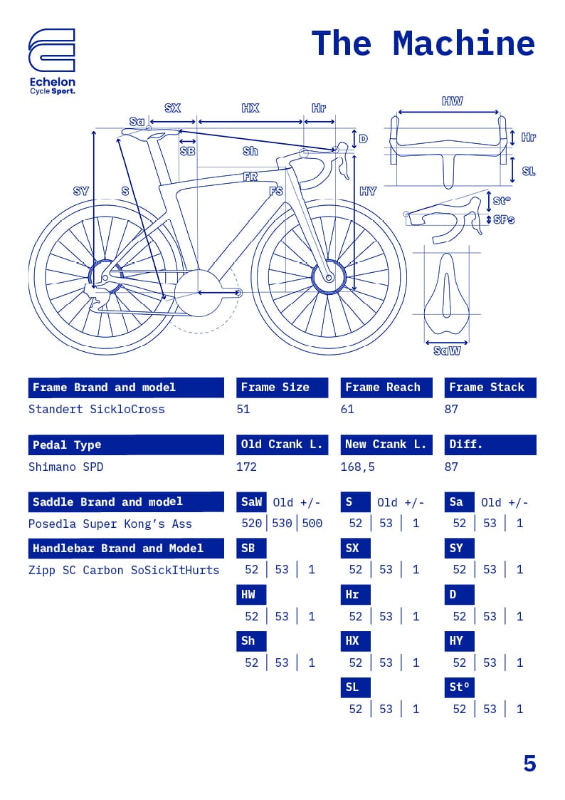
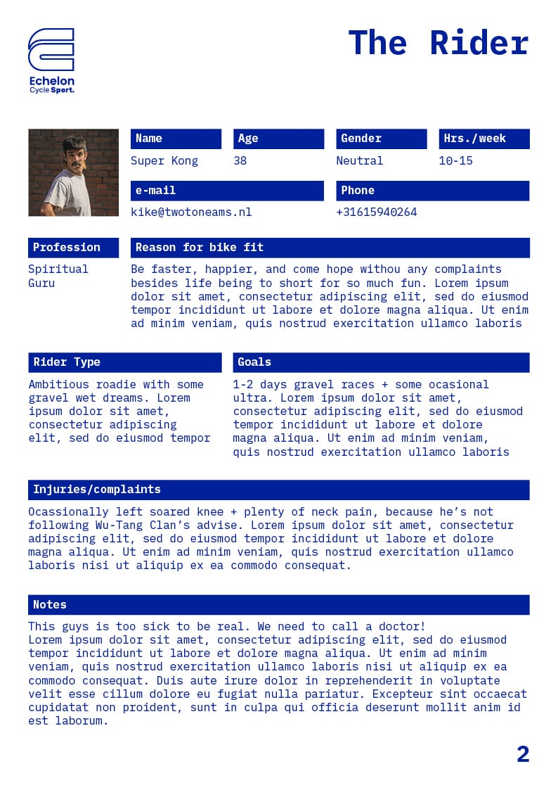
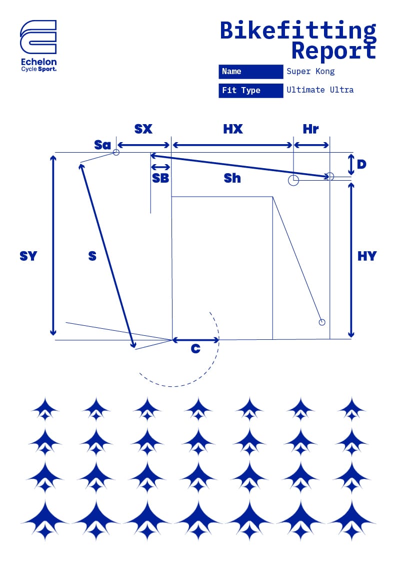
Seventh step: The BikeFitting report
Wim Essers is first and foremost a bike-fitter; his obsession with straight and clean lines inspired him when he’s checking a human body engaging in the simple but constant mechanic motion of cycling: what stays still, what moves, what’s aligned, and what should be aligned.
Since the beginning of the working relationship, Essers knew that he wanted a custom, perfectly designed BikeFitting report. He was also aware that the solution would not be a simple one, so without further ado, we got to work to creating several versions, in different platforms.
We tried the Locker Studio, a platform for data visualization from Google, which was great for those tasks, but not for visual design. Finally, Molares suggested InDesign and moved forward to implement the three months of design work into the new document that will become the staple of both the brand and Echelon business: the BikeFitting report.
Final Thoughts
The Echelon account remains one of the most cherished ones amongst the Twotone team, and a clear example of how the size of the company is not the relevant metric, but the vision of its director and their ability and temper to trust an agency to take their business and brand into a journey full of excitement, discovery, and success.
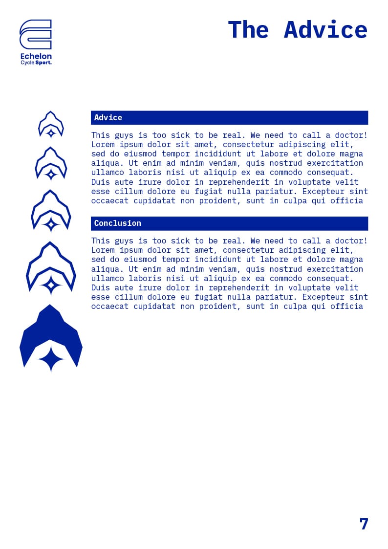
Represented on this page are the drafts by Molares of where the Echelon Cycle Sport brand could go in 2024.


